Spring into AI Submission: Web3 Crypto Dashboard
Crypto really is everywhere.

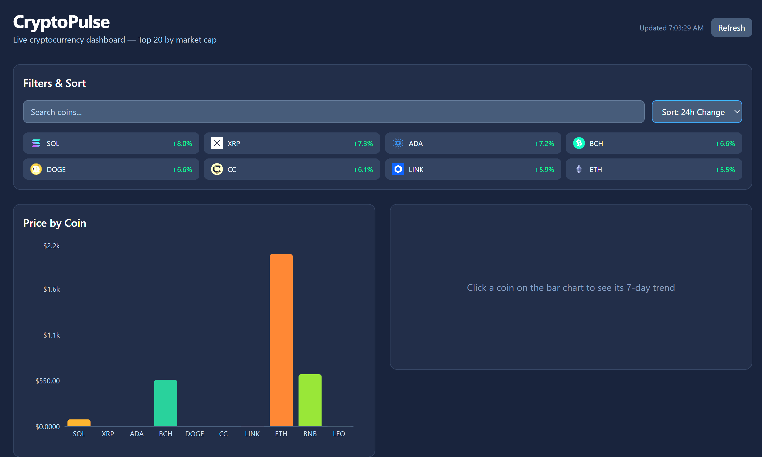
There are a lot of hidden things in this UI that make it very interesting. For example, it supports a much wider list of coins than the ones listed. And the data is… live? Nice!
Jake Strait pulls off a unique twist on the data visualization theme for the week with live data feeds and the first competitor to claim the bonus points for referencing another competitor’s work.
The application features from the github extol it’s capabilities.
Price Bar Chart — Top 10 coins by price, click any bar to drill into its trend
48h Sparkline — Area chart showing the selected coin’s price trend over the last 48 hours
Market Cap Pie Chart — Donut chart showing market cap distribution across top 10
Search & Sort — Filter coins by name/symbol, sort by market cap, price, 24h change, or name
Auto-Refresh — Live data from CoinGecko API, refreshes every 60 seconds
Dark Theme — Clean dark UI built with Tailwind CSS
Jake makes use of this prior submission in the crypto dashboard from Myles, in the spirit of competition we can find cooperation confers an advantage.
Try this app here
https://crypto-dashboard-ten-green.vercel.app/
Clone the code or contribute to a better version here: https://github.com/JStrait515/crypto-dashboard
Follow Jake Strait here on Substack for more updates